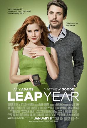
The ‘Leap Year’ is directed by Anand Tucker and produced by Universal Pictures and Spyglass Entertainment.
The written code such as title, actors’ name and credits are written in white. This colour is used to signify the expression of love. The white colour connotes the pure love between the characters. The dominant written codes are highlighted in order to appeal more to the audience when they see the film poster. The actors’ surname is highlighted in order to let the audience who has been a fan of those actors since the previous film they appeared is ready to shine again for a new film. The date is highlighted as if telling the audience to mark the date if they are interested to watch the film. The credits are in white but you can barely see what is written again tells us that the credit is insignificant but both credits and date conforms that this is an official poster of a film.
‘Anna planned to propose to her boyfriend on February 29th’- This line already tells us the bit of narrative cue of the film where the female character’s name is Anna and she has a boyfriend and she is about to propose her boyfriend. The box of ring anchored the word of propose. This subverts the stereotype of classic women however it would conform the stereotype of modern women. Ring is an indexical sign of marriage and conforms to the conventions of romance genre.
‘This is not her boyfriend’ – Then twist comes out where the tagline anchored the male character. When we first watch the poster and read the first written code we would assume that the male character is her boyfriend but it turns out that he’s not. We can signify this tagline conforms to the typical narrative of the film where the boy meets the girl. While the girl is trying to propose her boyfriend, the main male character appears in her life.
The colour of green cause the body to feel soothed and relaxed. This is used to relax the audience mind beside using the white colour which is too common in rom-com genre. This can help to let the audience absorbed well the information being conveyed.
The placement where Anna is overpowering the male character indicates that they are attracting wider female audience so that female audience could relate themselves to the storyline of the film. Also, this conforms the poster to be a rom-com genre since the genre is mostly dedicated to female audience. The placement bring out the contradict characteristics of both male and female characters.
