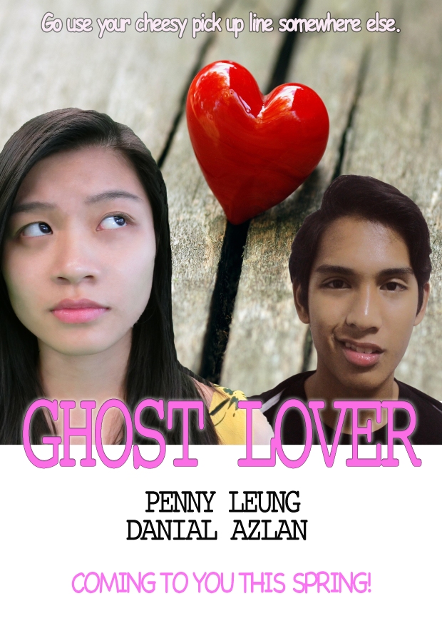
[First Draft]
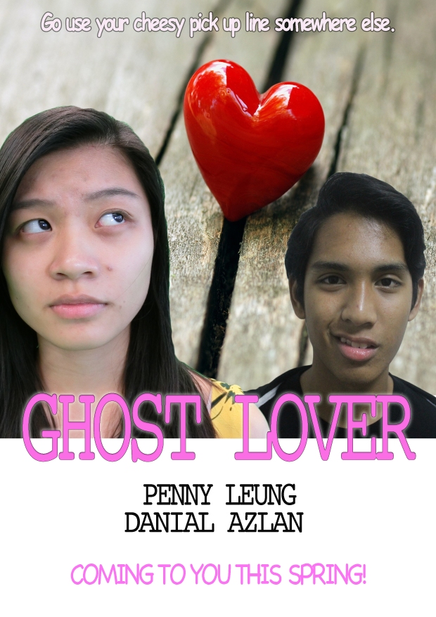
Image above is the first draft of my teaser poster. These are the steps of how I layered the images:
- I put the background image of the love and I positioned it higher. This is because I wanted to put the characters below the indexical sign of love.
- Then I positioned the character as I have planned. I put the female character at the left side purposely to make her looks at the love symbol. The female character’s image is also larger compared to the male character which helps to convey the hidden meaning behind the poster. The placement connotes that the female character is dominant which may anchor the narrative of the film.

- Next I put the title of Ghost Lover using Cambria typography with black outside stroke and outer glow. The glow signifies the bright mood of the film. The colour pink symbolises that the film is a rom-com genre.

- After that I put the actors’ name and the hint of when the film is going to be released and not giving the exact date since the film is still under production. ‘Coming to you this spring’ this follow the seasonal conventions of rom-com. Spring is the peak of most rom-com films will be released in the cinema. I used pink for the font to make it brighter and catchy which will captivate the audience attention immediately.
- To make it perfect I included the tagline for the poster. This tag line originally comes from the script. I purposely make the tag line to be disorientated, to let the audience wonder where the tag line comes from? From whose perspective? This imply the enigmatic codes in my poster as the audience are puzzled. From both characters’ face expression, the tag line can be came from either of them. If the audience wants to know, they must watch the film. This is the strategy of my marketing to promote the film.
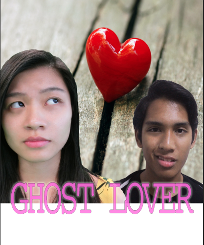
[Second Draft]
For the previous draft, I only arranged the position of the images according to how I wanted it to be without touching up the characters’ face. In this second draft, I touched up the characters’ face to make it looks cleaner and more attractive. I used spot healing brush to cover up the obvious acne. I also used the colour balance and brightness/saturation to change the colour and brightness of the male character in order to be compatible to the female character. The image turns out to look weird and unnatural.
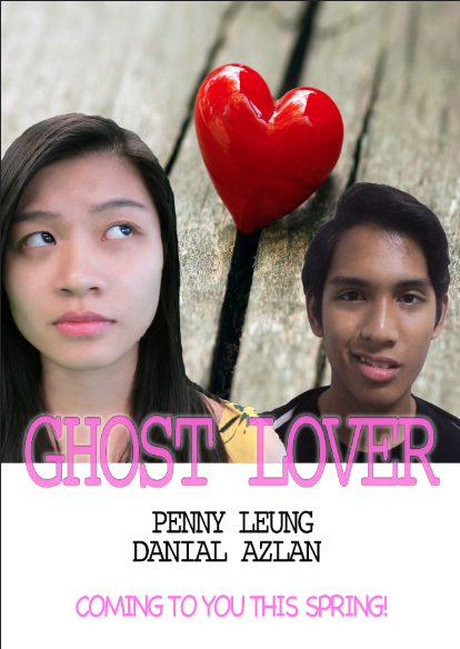
[Third Draft]
Previously, I used colour balance and brightness/saturation on the male character’s image but it turns out unnatural. Therefore, I tried to adjust again using the colour balance and brightness/saturation on the male character’s image and just colour balance for the female character.


Below is the result of my editing in photoshop and automatically becomes my teaser poster for the film.

